The intersection between art and science
You often hear that art is a science, though not in a literal sense. The difference between art and science is indeed unambiguous. Art transcends the rigorous methodologies and constraints of science, which seeks to understand the natural world as it exists, not as we conceive it through imagination. Art, on the other hand, thrives on imagination.
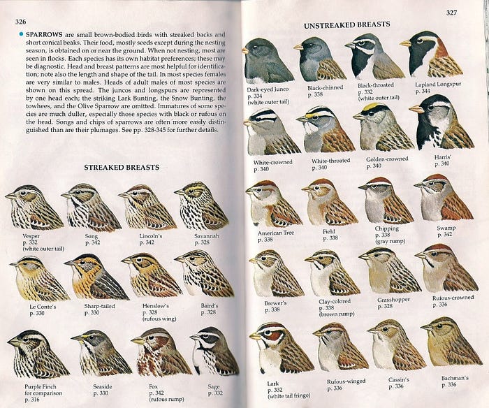
Despite their differences, art can draw inspiration from science, and science can exhibit aesthetic qualities, ranging from illustrations of the natural world to data presentation. Leaf through any natural history guidebook, and you will encounter exquisitely detailed illustrations that accentuate the key features and distinctions between species. Here, art serves science.

Art can also influence how scientific data is presented. The same data can be portrayed in an uninspired, or shall we say, artless manner, or it can be displayed with careful attention to layout, color, and font, transforming it into a visually appealing, artistic form.
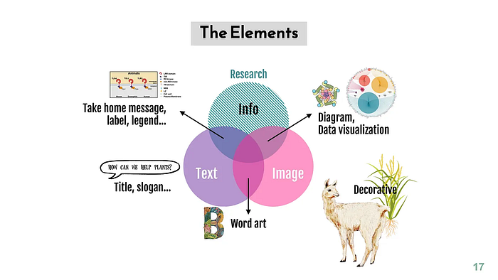
Consider the work of my colleague Hsuan Pai, a scientist with a remarkable artistic talent. She adeptly communicates scientific concepts through her illustrations, and describes her approach in the presentation: “Illustrating the World of Plants and Their Biotic Environment.” Pai not only indulges in drawing and crafting but also integrates her scientific acumen to ensure accuracy. Her skills are invaluable to our team, enhancing everything from posters and graphical abstracts to data figures, enriching our presentations, publications, and contributing to grant proposals getting funded. Through Pai’s work, art serves science, enriching our understanding and appreciation of both realms.


“Beautification” of figures
The act of “beautification” in scientific contexts refers to enhancing the visual appeal and clarity of data presentations, which is crucial for effective communication. Thoughtful design choices, including color and layout, can significantly aid in the comprehension of scientific findings.
However, the term took on a notoriously bad connotation in the wake of the ETH Zurich report concerning Professor Olivier Voinnet’s publications. The investigation highlighted instances of figures being “beautified,” as a response to questions about the integrity of data representation. This controversy serves as a reminder of the fine line between enhancing clarity and misrepresenting data. While the intent may not always be to deceive, the ethics of data presentation require that any visual enhancement correctly represents the data in question and does not alter the underlying truths that the data represent. The debate highlights a broader ethical consideration in scientific communication: the balance between aesthetic improvement and the accurate, transparent presentation of scientific work.
This is what ETH Zurich wrote in a news release about the report of the commission of inquiry on the Voinnet publications, turning “beautification” into a sorry punchline:
In the publications produced at ETH Zurich, the commission found errors in a total of five publications, ranging from the “beautification” of figures to the mere confusion of correct and incorrect figures.
But where does beautification end and unethical manipulation of images start? Where do we draw the line? What about the example below? I leave it to your judgment whether this type of Photoshopping constitutes merely enhancing the figure’s aesthetics without any intent to deceive. However, we can concur that, given the effort involved, it nearly qualifies as a work of art. One might argue that such effort would have been better invested in generating original data with superior appearance.

Ernst Haeckel’s beautifications: art or science?
I was reminded of the interplay of art and science during a recent visit to the Musée Des Arts Décoratifs in Paris. The Musée was hosting an exhibition that celebrated the innovative work of Dutch designer Iris Van Herpen, who, according to Vogue Magazine, has forged unique connections between haute couture craftsmanship and diverse realms like science, nature, technology, architecture, art, and dance. Her designs, profoundly influenced by scientific and natural elements, were truly breathtaking. She even drew inspiration from the fungal kingdom, and I was delighted to see that favorite plant-associated fungi such as Penicillium and Cladosporium were mentioned.

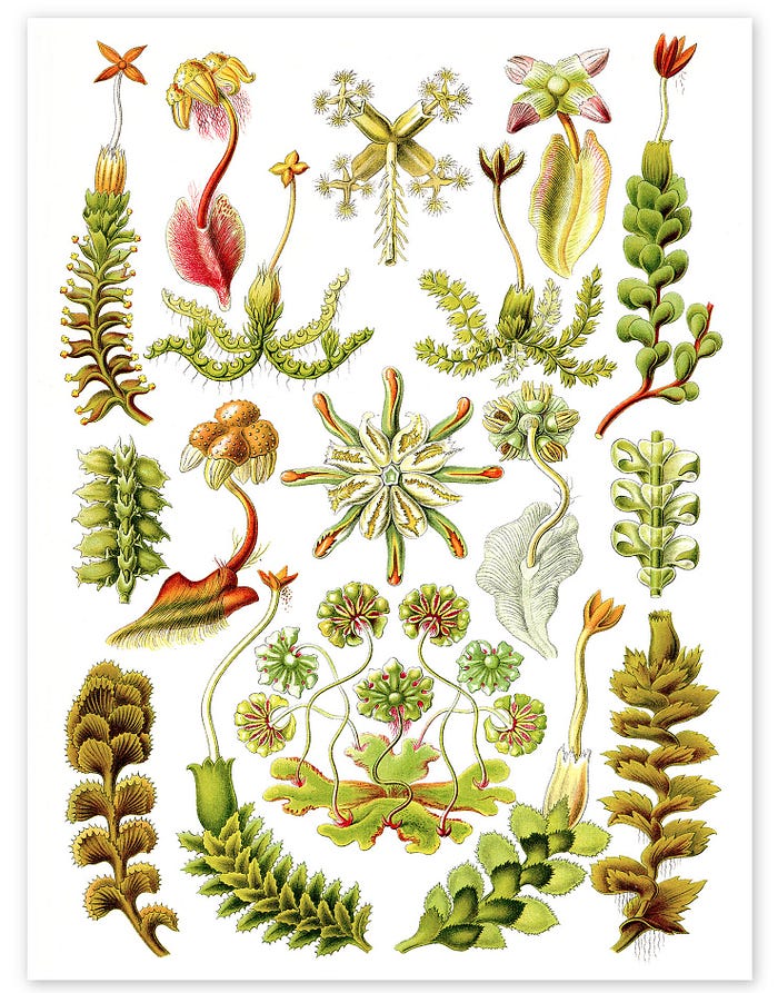
Among the figures who inspired Van Herpen is the German scientist and artist Ernst Haeckel (1834–1919), renowned for his exquisitely detailed and symmetrical illustrations of natural subjects, ranging from microorganisms to plants and animals. Haeckel described thousands of species, championed the work of Charles Darwin but also proposed flawed and racist theories. However, Haeckel’s approach was unapologetic in its artistic flair, aiming to highlight the inherent beauty in nature’s forms. But did he cross a line? Did his artistic tendencies compromise his science?

Haeckel’s blending of artistic perfection with scientific illustration sparked controversy. Critics like evolutionary biologist Stephen Jay Gould have contended that Haeckel’s artistic liberties undermined the scientific accuracy of his work. Gould criticized Haeckel for beautifying his drawings, portraying idealized versions that exhibit greater symmetry than the actual specimens, and he accused Haeckel of leveraging these idealizations to bolster speculative theories. Despite this, some scholars have countered Gould’s critique, maintaining that Haeckel was transparent about his tendency to idealize his subjects. This controversy underscores the fine line between artistic enhancement and scientific integrity.
Haeckel’s method of aesthetic enhancement and idealized symmetry is perhaps most evident in his stunning illustrations of liverworts (Liverworts, Hepaticae, Art Forms in Nature, 1899), a group of non-vascular plants that have garnered considerable research interest recently. We all know that plants in reality do not exhibit such perfection. Therefore, perhaps Haeckel deserves a pass, as his stated intention was not to portray a specific individual with its unique characteristics but rather to average out the traits of a population that characterize the species and highlight the salient features of the organism.

Imposing symmetry in structural biology
Over a century since Ernst Haeckel’s time, structural biology is another scientific domain producing beautiful, often symmetrical illustrations of biological life. One technique, single-particle cryo-electron microscopy (cryo-EM), has profoundly influenced my field of plant immunity. It has unveiled that plant immune receptors can assemble into stunning symmetrical structures known as resistosomes.

Echoing Haeckel’s penchant for idealized imagery, cryo-EM structure refinement can enforce symmetry on the biomolecules being examined. This imposition of symmetry is a common practice. It is typically employed when the biological molecule in question is understood or assumed to possess symmetrical features.
Symmetry imposition is particularly useful for large protein complexes with repetitive subunits, as it reduces the computational complexity of building the model and can lead to better-defined structures. During the refinement process, if the protein or complex is known to exhibit specific symmetry (such as C2, C3, C4, etc., for cyclic symmetry or D2, D3, etc., for dihedral symmetry), this symmetry can be applied to constrain the model fitting, ensuring that all symmetrical components are treated as identical repeats.
This is exactly the approach my colleague Selvaraj Muniyandi employed to determine the symmetrical homodimer structure of the plant immune receptor NRC2. In the research paper, he detailed the rationale and methodology behind applying C2 symmetry to the data:
The 2D classes revealed a clear dimer with secondary structural features in many views. Clean 2D-classes were selected (664,305 particles) and were subjected to 3D classification using an ab initio 3D model generated by RELION. The best 3D class revealing the protein fold consisted of 229,347 particles and was subjected to 3D refinement using Refine3D using that 3D class as a reference with a circular mask of 180 Å. Following examination of the C1 refined map, a C2 symmetry was applied.

The risk of inappropriately imposing symmetry on data exists, but there are ways to address this issue. Imposing symmetry would be noticeable as it would deteriorate the map quality and decrease resolution. Fortunately, there are symmetry relaxation methods available to enhance the refinement of pseudosymmetric particles.
Nonetheless, it’s important to keep in mind that not all multimeric structures exhibit perfect symmetry, and any apparent noise in the data might hold biological significance. Symmetry correction could inadvertently mask subtle yet significant asymmetrical features, such as the asymmetrical breaks found in virus packaging elements (capsids). There are also instances of asymmetric dimers and tetramers. The Magnesium channel CorA, which forms a pentamer, incurs a loss of symmetry when transitioning between its closed and open state conformations.

What to do? Disclose all your beautifications
Aesthetics can complement science beautifully. An artistic touch can indeed enhance scientific figures, making the work more impactful for experts and accessible to a broader audience. Enhancing the clarity and visual appeal of scientific outputs is not only acceptable but beneficial. Even a well-considered color palette can significantly enhance understanding.
In this context, beautification — enhancing the aesthetics of scientific outputs, like publication figures — is commendable within science. However, it has its boundaries. Beautification should not entail replacing or masking a gel band even if it’s for aesthetic purposes. This approach is simply unethical.

The question often arises: Is it acceptable to modify a figure in this way or that? While certain boundaries should not be crossed, many decisions depend on the specific context. However, if you decide to enhance your figures for clarity, you must disclose these modifications. Not revealing how figures have been altered can lead to accusations of concealment or even fraud.
The key is transparency. If modifications or enhancements are necessary for clarity, you should proceed but always ensure full disclosure. Additionally, it’s crucial to provide access to the original data. Neglecting to do this can lead to accusations of fraud and misconduct.
Maintaining integrity is the one core value that unites both art and science.
Postscrip: the science of symmetry
After publishing this post, I discovered a wonderful video by my John Innes Centre colleague Laila Moubayidin on ‘The Science of Symmetry.’ Indeed, as Laila explains, symmetry is everywhere. Check it out.
Acknowledgements
I’m thankful to Slim Fourati for recommending the Iris Van Herpen exhibition that inpsired this post. I’m grateful to Saskia Hogenhout, Michael Webster, Selvaraj Muniyandi, Sebastian Schornack and others for their input and critical suggestions. The article was written with assistance from ChatGPT.
This article is available on a CC-BY license via Zenodo.
Cite as: Kamoun, S. (2024) Beautification: When art is not science. Zenodo. https://doi.org/10.5281/zenodo.10805121
